Week Four: Close Encounters of a Historical Kind
I’m convinced that before this week, I’ve never used my laptop at full power before. Never have I heard my fans sound closer to what I would describe as a plane approaching take off than I did when I was trying to use the “sort” feature in AntConc. While this week’s central focus was on seeking dialogue with the information we’re analyzing, I found it to also be somewhat of a study in different ways the same task can be completed, and how the processes to achieve the same final result can lead to different or even greater understandings of the material they’re working with.
To GUI or not to GUI?
A key discovery I made this week is that although GUIs can sometimes make a task that would otherwise require some programming more accessible to those without that skill set, sometimes, programming is just plain easier. The first activity of the week was counting and plotting in Excel; I must say, I have some bias against Excel due to an internship in which it was misused as a database to store more than 80 000 items, but from that experience, I also learnt the magic of Excel formulas, so I accepted its usage in this situation. As a mac user, I finally was given the opportunity to use my subscription my school gives for Office 365, making it so I could use Excel Online. I was able to experiment with formulas, but I quickly learnt that Excel Online is a less-than-complete tool for digital history, as you can’t select multiple columns using cmd/ctrl, it only offers click-and-drag functionality. I was able to generate basic graphs through deleting columns then backtracking and undoing what I deleted, but I didn’t spend too much time on this, because the following activity seemed to be performing the same functions, but using R instead.
Setting up the data in RStudio required just a few simple lines, but the initial bar plot that we generated was certainly a bit wonky. There were numerous visual errors where some bars extended beyond the numbering, the axes were mislabeled, and some bars were not labelled at all! Also, because of the significant difference in numbers when it came to the type of article being published, the y-axis wasn’t scaled appropriately making it hard to discern numerical data. I did some small fixes as you can see below to try and improve the outcome.
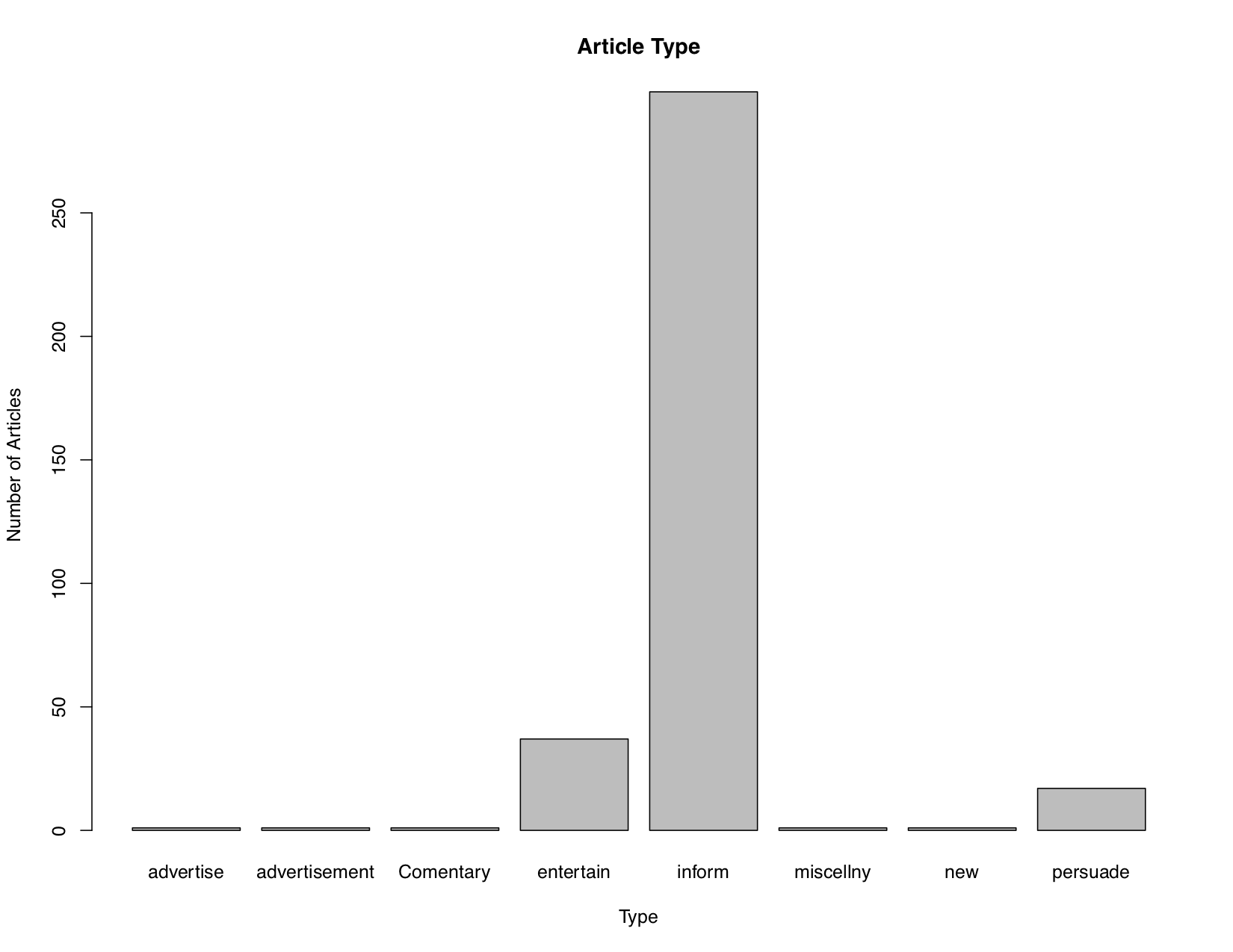
It’s still not perfect— I’m still a beginner in R— but you can still derive some basic information from this graph. Why was there such a large number of articles meant to “inform”? Further, what was considered informative? These questions could be the beginnings of a closer inquiry into how their acts of colonialism were perceived during the 18th and 19th century British Empire. After exploring the extended tutorial, I definitely enjoyed using R more than Excel thanks to the control it gave the creator over the graphs produced from data, but perhaps I would enjoy the next GUI tool, Voyant.
Bon Voyant!
A good tool indeed! From the initial video we watched, Voyant was appealing in its numerous ways to analyze and visualize data, making it feel very accessible. Despite my dislike for overcrowded or busy GUIs, I wasn’t pleasantly surprised to find that I felt it wasn’t a problem in Voyant despite the 4 different panes of information. I did have some error using it; I wasn’t able to fetch the data we were supposed to use for the initial exercise via URL, so I had to download and upload the file. But then when I tried to modify the table settings to control what was inputted, the table settings refused to apply. Voyant being a niche tool meant that googling my problem lead to no resolutions, thus I succumbed to using the provided link to the already created corpus.
The data used in this corpus was meant to analyze the ways British newspapers framed Britain’s relationship with its colonies, and from what I know about colonial Britain, I predicted that there would be data that demonstrated some form of exotification of their colonies, expansion of Empire with lesser regard to people living on sought out lands, and/or the “civil/savage” narrative reinforced in some way. I looked through the data and noticed that there seemed to be a couple of non-words extracted from the set, which brought me to the stoplist function where I could add my own stopwords— never having heard of stopwords prior to this, I’m saddened by all this time never having known about such a useful function! It’s like a GUI-based .gitignore file! I wish the pane for viewing stopwords in Voyants was larger, but I was still able to exclude for matters such as “äì” from my visualizations, and find that my predictions about this data may have been correct, as the highest trending words were all descriptions of nation or grandeur, though I would need to perform a closer reading to further confirm what I assumed.
The prompt to look further into a different data set to build our own corpus I took at face value, so I created a corpus by pulling 300 articles from the Chronicling America database that contained “Canada” as the keyword, from between 1945-1955, because I figured with all that was happening in North America during this time period, it would result in very revealing thoughts on how Canada was perceived by Americans. When I initially put the table I created into Voyant, it was made apparent that the data needed to be cleaned before it could be used, so I simply used REGEX in the CSV file to clean up any particles or common typos. Voyant informed me that the most common term was, unsurprisingly, the searched keyword “Canada”, but that the second most appearing terms were “united” and “states”. Look at these terms’ contexts, articles were focused on the relationship between the United States and Canada, but also the United Kingdom, often discussed in relation to Canada. Otherwise? The overwhelming majority of the “articles” pulled that referenced Canada were actually advertisements for Canada Dry Ginger Ale, apparently very popular during this post-war period!
The GUIs that Caused Me Grief
I, frankly, barely got through more than a chunk of the AntConc tutorial before calling it quits. The first red flag was upon downloading the application, which upon opening was entirely in a lower resolution than my screen? Like, even when it opened my file manager so I could select the working directory, my file manager was low-res too. Certainly odd but I pressed on because this didn’t seem to affect the functioning of AntConc. I particularly liked how stopwords were used in AntConc, as well as it’s search functionalities allowing me to easily find simple identifiers such as “the”— this is excellent for analyzing histories on a micro-scale. At first, I found what the program outputted difficult to understand, but after learning about and employing the use of the “Sort” function, I was able to create what I felt to be a much more readable output format; I especially liked to sort using 4L 3R 5R, as the extra contextual information made the data more useful to me as a historian. The major issue I ran into with AntConc? No matter how few or many files I gave it to analyze, it kept intermittently crashing my computer! Everything would freeze and I’d have to reboot, leaving me somewhat frustrated but with a new appreciation for auto-save. I accepted my defeat after the 3rd crash, and jumped into the Python tutorial meant to do the same type of work. I’m not a fan of how Jupyter Notebook has you write programs in separated blocks, but at least using Python to analyze text in a similar fashion doesn’t use both of the cores in my laptop that only has a dual-core processor! While AntConc makes this form of large-scale text analysis more tangible and perhaps less tedious for some, it can be limited by the technology used to perform its operations.
The Topic Modeling Tool was also a GUI that was pretty straightforward to use— specify where it needs to pull files from, specify where it should output the topics generated, and hit “go”. Yet even when I experiment with how many topics should be generated, I still really struggled to interpret these results. What did all these numbers mean? How were they calculated? Where did they come from? Unlike in the examples from the tutorial, the CSV containing metadata only listed filenames and then the created topics as columns, nothing along lines of “genre” or “year”. When I looked at the file on topics in metadata, I end up with many repeating variables within the pie chart, making any information difficult to interpret. After staring at the few graphs I attempted to create, I realized not being able to find correlation using “typical” things I understood such as dates or genre made it so I couldn’t seem to find any patterns or create some form of narrative from what TMTool gave me. I moved on to topic modelling in R to see if I would perhaps understand the results better, and immediately, the nature of programming made things clearer. Occasional outputs from cb commands were very readable and helped me understand what was happening to the corpus as it was being transformed. Programming and writing out how the end result is achieved, step by step, lead to a much greater understanding of what I initially found to be a confusing end result. I understood the parts of what lead to the final, visual model, so now I was able to have fun. I first created a model with 5 topics to represent the most significant topics found:
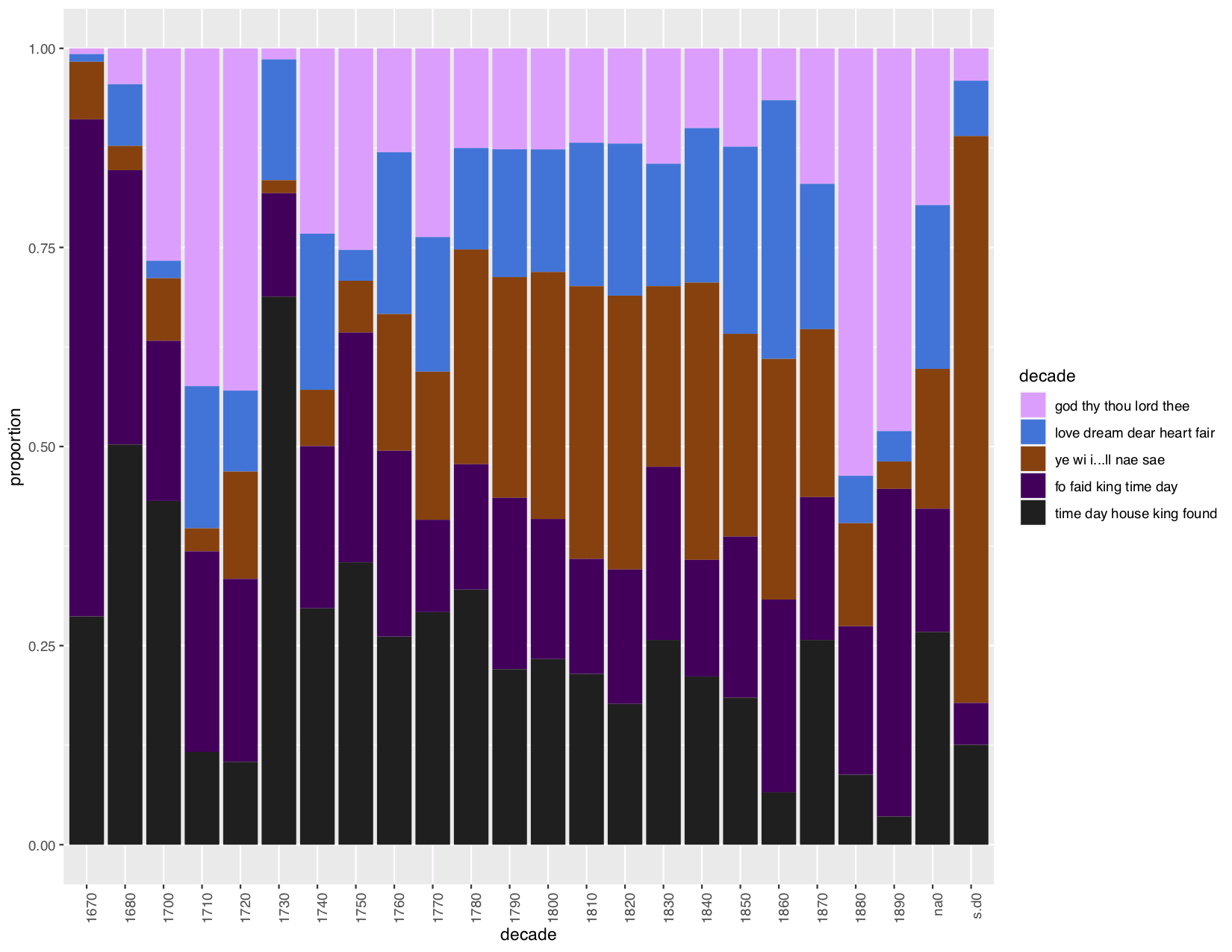
Topics regarding religion and the monarchy were consistently dominant. I wonder, were these things mentioned in worship or satire? I then created a model with 20 topics for a closer reading:
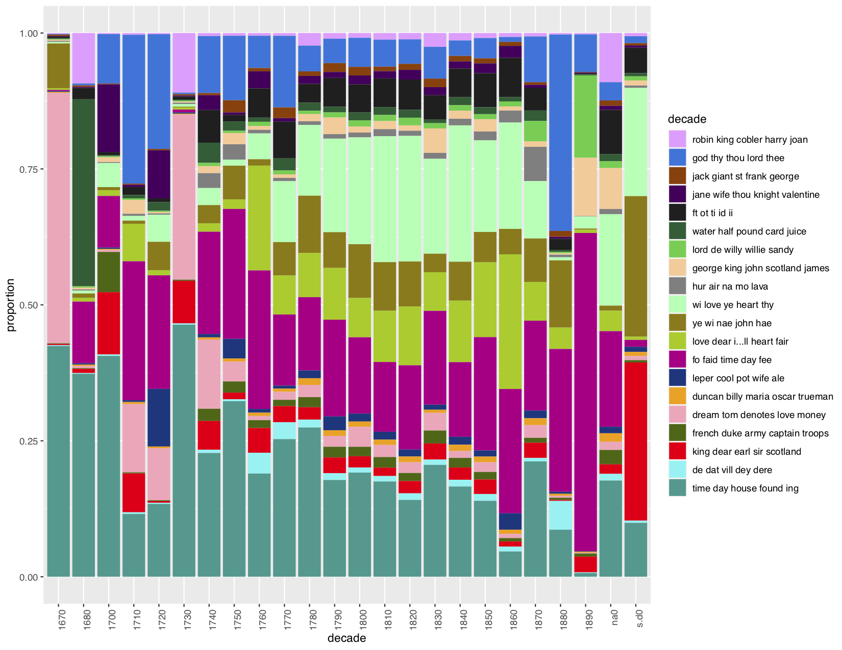
Here, it seems that “domestic” topics (time, day, house) were very common subjects at the end of the 17th century, but by the 19th century were quashed into going nearly unmentioned in the Scottish Chapbooks.
Near… Far… Where EVER histories are
It seems that in digital history, there’s a constant cycle of jumping from close and distant readings— constant interpretation of data on both a microscopic and macroscopic scale— and that is what I feel makes this field so challenging yet unique in the novel way it interprets history. The process of research in digital history is actually very similar to the typical historical research methods. Or at least my typical methods. You start with a couple of vague ideas, then find some more information on those hypotheses to dig a little deeper. The main difference present in digital history is that instead of reading numerous articles and books to kickstart start closer readings, you can look at extracted and parsed data from an archive to find both greater patterns and smaller meanings through looking at points within those patterns. One can analyze and closely look at a single point on a scatterplot, or zoom out and place that single point into a greater context, and this can form an excellent starting point for further research. Working with data, models, numbers etc is not something typically associated with historians or their work, but it’s proving itself to be invaluable to me with every new lesson.
Digital work places details within their larger context, and gives larger context to the massive clusters of data made up of individual parts. I believe Hitchcock’s article demonstrates this concept best with his analysis of prisoner Sarah Durrant, using much of the digitally archived data available about her and placing her into the context of the greater London area. From Sarah, the single woman, criminal, and data point, Hitchcock was able to then compare her speeches from trial to how other women of the same age and class spoke, use the intimate descriptions of her home to place her in a specific lower middle-class neighbourhood in London, and finally contextualise her experience among hundreds of thousands of defendants like her in the 239 years’ worth of records from the Old Bailey, locating her life in relation to “the rise of ‘plea bargaining’ and the evolution of a new bureaucracy of judgement and punishment”. Digital history opens up uses for me that I never previously thought of, altering my perceptions of history on behalf of the constantly shifting scale. At the end of the 2020 Winter semester, I was writing an essay on how the changing appearances and beliefs surrounding the waist shaped how women were perceived in 19th-century British society, and much of my information was pulled from archives of the Englishwoman’s Domestic Magazine. I scoured the pages from the relevant era, manually searching for words such as “corset” or “waist”— I knew I was likely missing some information but I could also only do so much with a due date approaching. This week’s lessons have made me reflect on the process I took in researching that essay, and how much better it could have been! If I knew then what I know now, I could have set “waist” and “corset” as search keywords in a short Python script to pull everything mentioning those words from the digitized EDM archives. I could have then placed the contents of those pages into a CSV file like I did with “Canada” as pulled from the Chronicling America archive, and visualized that in Voyant, finding the common terms besides those searched for to begin determining associated beliefs. For close readings, I could look at the terms placed in context, reading the articles with only the most relevant findings. For distant readings, a topic model created through R could have been made use of, finding the broader categories and contexts in which discussion of the waist was most prominent. The possibilities of how that essay could have been rewritten feel endless to me had I used a digital history lens. The conclusions could have been more solid, with data backing them up. Maybe I’ll redo the essay just for fun? Well, actually I’ll have to see what shiny new things I learn next week first.