Week Five: Creation in Context
You are presently reading a post on a website that almost didn’t exist. This week of telling compelling stories through design started off strong for me– a focus on aesthetics for someone whose primary interest in terms of programming is web design is guaranteed to be a hit! I learned about a handful of new, interesting tools that can be used to represent data through mapping, create simple colour palettes for visualizing data, and go MUCH more familiar with Adobe Illustrator. When it came to moving my static site from Jekyll to Hugo though… that’s when things got a bit hairy.
Mapping & Making
As soon as I went through the weekly “readings”, I immediately knew I wanted to know more about mapping. Looking through the DH Awards for Data Visualization, the winning visualization from the University of Edinburgh that mapped out the places of residence of accused witches was truly a compelling piece. I spent 30mins just clicking through the small, woodblock-esqe icons, wanting to know more about all of the accused. I then wanted to know more about how something like this could be created– and luckily, it was a topic for this week!
The first endeavour into creating a narrative with maps was using StorymapJS, and to be honest, I wasn’t much of a fan of this tool. I think it certainly has its merits, as it was easy to use and would be good for presenting a simple historical narrative, but the slideshow sort of styling I found to be a bit cluttered and not very visually appealing. It seemed to easy to fall into the fallacy of over-writing and making a very text-heavy map (even I think I fell into this trap…). About two years ago, I was in a class that collaborated with the NCC, in which me and my team created a wrap for a traffic box that conveyed one of Ottawa’s many histories. The topic we chose (and that the NCC used) was to share the life of Ottawa photographer Malak Karsh, also known for creating the Tulip Festival. Thanks to this project, I know a lot about his life– a life full of travel– thus I decided to make a quick map using the StorymapJS tool to construct his history into a visual narrative using his photos to mark locations.
I made some small creative decisions, such as using a tulip vector as the map marker, and I created what I thought StorymapJS was best used for– telling a story through location. It would’ve been cool to make an even more detailed map with more locations for this specific project, so that if you zoomed out Canada could look like a whole tulip garden; but, I didn’t want to spend ALL my time on this map when there was more maps to be made!
The next mapping tool was Leaflet, and this seemed to be closer to what I was looking for– closer to how the aforementioned map of witches was produced. There was a lot of what I would consider “technical” terms in the initial explanation of web maps, and as someone who’s never touched this kind of thing before, I was left a bit confused, but still persistent. As the lesson went on and adding layers were explained, I gained the understanding I lacked before about how tiles work in a map (I think I was too hung up on the pyramid shape of the diagram…)! And although I found the Map Warper UI a bit difficult to navigate– it felt similar to when you have too many tabs open at once– georectifying the base map and adding a historical map as an overlay was so simple! This process also gave opportunity to look even more closely at the historical map I chose as an overlay, comparing it to how the shape and sprawl of Ottawa has evolved as I pinned each control point. I’ll certainly be using this method of map creation in the future, and want to learn more so I can improve the appearance of my maps. Currently, my overlay is very low resolution and the animation of it appearing is somewhat choppy– I’d like to experiment with solutions to create a better user experience.
Academia Arts
I’ll admit, when I first saw the topic of “Posters”, I was NOT thinking of the kind of poster we ended up making for the lesson. I was drawn to the topic because I currently generate promotional content for the CCSS, and hoped that it might add something to my graphic design skillset. That’s not to say it didn’t! It certainly did! Just not in the way I expected it to. While the lessons were done in Inkscape, I chose to use Adobe Illustrator instead. I actually already had Inkscape installed because I once had to create a vector for some custom keycaps I wanted to be made, but it’s because of this that I know me and my computer don’t get along with it. It has to be virtualized using XQuartz, which my computer hates and causes the application to lag, and because it’s a Windows program it only accepts Windows shortcut keys, which REALLY messes with me.
The simple activity of sprucing up a bar graph pdf already gave me a new understanding of Illustrator’s grouping/ungrouping function, and using Colour Brewer I made a 5 colour palette to recolour the bars of the graph. The focus of this activity was to learn to work with the given vector-based software, so I let it slide at that moment, but my colour “ranges” are technically inaccurate if you look at the legend.
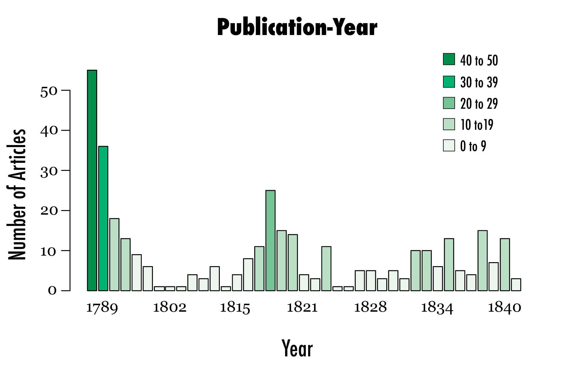
If you look closely, you’ll notice one bar goes beyond the graph, yet the colour I assigned it is for bars that indicate a range of 40 to 50. I personally would have scaled this data differently so broader range could have been shown, but alas, this was an activity of modifying what you’re given, so I moved on. The final change I made was to the fonts to differentiate between titles and labels, but this was essentially the same process as it is in Adobe Photoshop, a tool I’m much more familiar with.
Now, what I’m used to making is event posters– I’m not entirely sure if I’ve looked at or seen an academic poster before (or at least, for the humanities, anyway). They honestly remind me of those projects you did in elementary school, where you’d pick a topic, go to Dollarama and get a big ol’ poster board, then go home and print pictures from Google and write small snippets about the topic that you would later print, cut, and glue to the poster board. Academic posters are the Big Kid version of that.
I read through Purrington’s notes and went to start the activity using the suggested Sangiorgi/Breuer designs, but a problem came up which was that I strongly disliked both of the given designs. Overall, I find both to be too “scientific”– the designs don’t capture the creativity of work in the humanities. They were clearly geared towards supporting lots of equations and visualizations of data, which may work for digital history, but since we were told make an academic poster for our favourite essay, and I have none that employed digital history devices, these designs felt irrelevant to me. A smaller note too was that, while I generally agree with Breuer’s note on colour, I strongly disagree with his notion that posters shouldn’t use flat colour. I KNEW his poster design was from ten years ago; at this point in time, gradients date his work while not adding much visual interest. Flat colour is fine for modern more minimalist design, and visual interest is generated numerous other ways, such as using contrasting palettes, by creating shadows for boxes, using small patterns for backgrounds with no text and translucent boxes for titles, etc. So that was basically a long way of me saying that rather than using a template, I referenced Purrington’s notes for horizontal posters to make my own design. For consistency, because I mentioned it last week, I made the poster for my essay on the 19th century British perception of the waist.
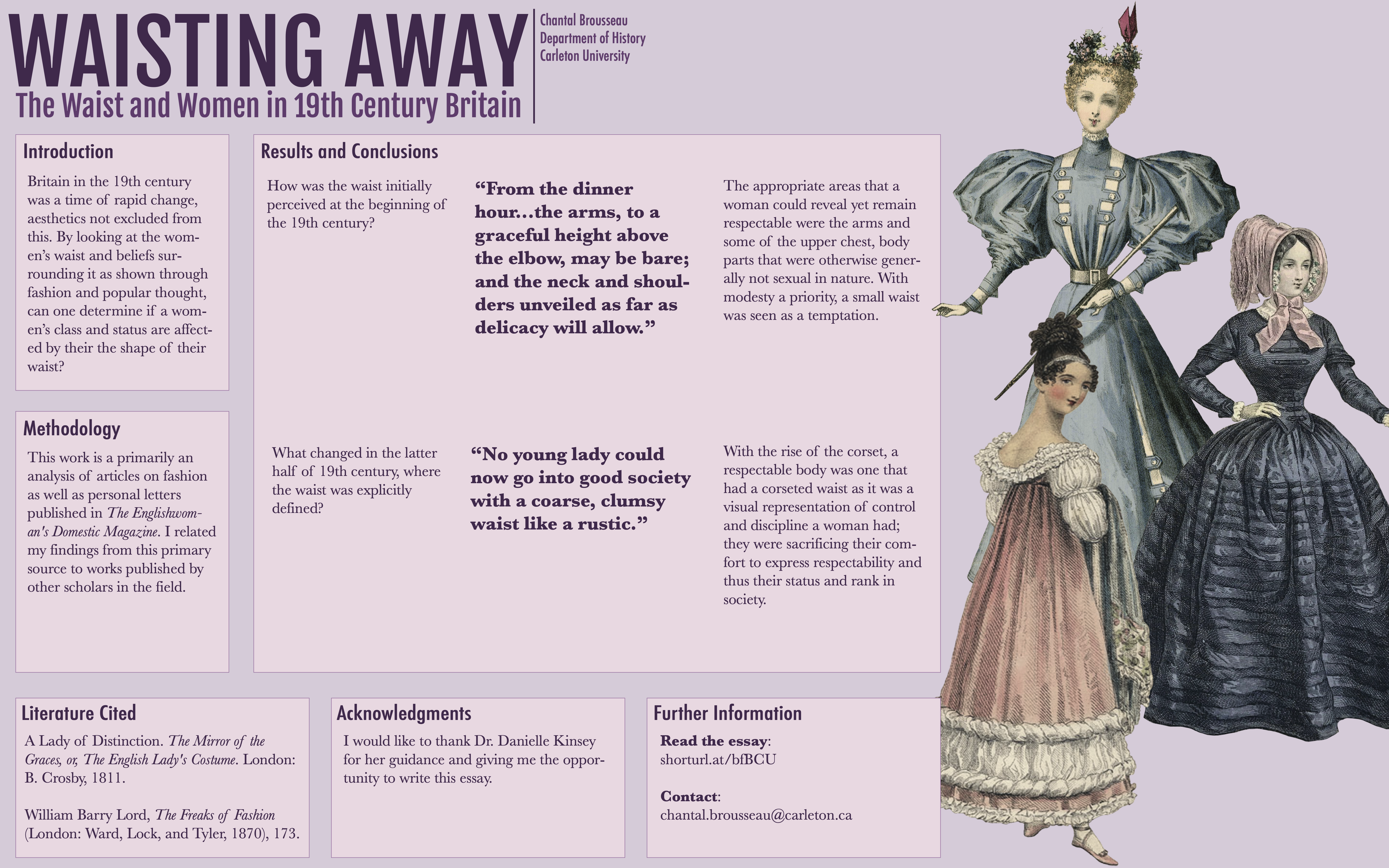
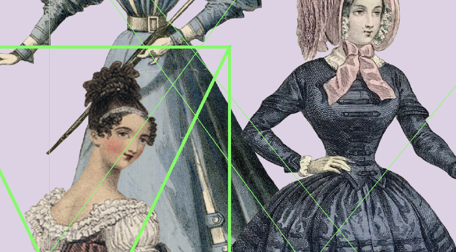
Ta-da! If you really want to read it, you’ll have to zoom in, but this was the result of my efforts. It’s… pretty boring. There were no visuals for this essay, so I tried to make use of the Golden Ratio and dedicate a section to a group of cascading fashion plates, sorted from smallest to “largest” waistline. I felt it was a relevant visual, especially after someone reads the poster, and frankly, I needed something to ensure that this poster wouldn’t just be blocks of text. And yet… it’s still such a boring poster to me! There’s so much text! I also think I should have used a more diverse colour palette rather than a single-hue one, It may have made all that text stand out more. This type of poster is definitely challenging for conveying a work that has no visual outcome or byproducts. It left me wondering, what IS the best way to “advertise” something like my essay? I still haven’t come up with an answer…
Migration Mania
The most significant project I undertook this week is something I almost wasn’t able to write about: the site you’re one right now, reading this. In prior weeks, I’ve been publishing my journals to another static site, one that was created using Jekyll and deployed using GitHub Pages. It’s been working fine, but I know that the more I post, the larger my Jekyll site gets which means that GitHub Pages will start taking longer to build my updates. At the encouragement of my Professor and the internet, I decided to try migrating my site to use Hugo and deploy with Netlify.
Hugo has extensive documentation via their website, which led to this process getting off to a great start! Installing Hugo was much easier than installing Jekyll, as Hugo didn’t have any new dependencies I needed to install. A quick brew install hugo and I was one and done! I then found out about a command that supposedly would convert your Jekyll site to Hugo, hugo import jekyll jekyll-site-folder folder-for-hugo-site, and so I gave that a shot too.
“Wow, this is so easy!” she thought to herself (hint: she was wrong).
I opened up the folder for my Hugo site, and while I was happy to find all of the content from my website there, the actual code that made up the website was missing. And this is when it occurred to me that Ruby/Jekyll and Go/Hugo definitely have different syntax, so of course I could just directly port my styling. I liked my Jekyll site’s theme though, so I decided to look in to just manually fixing the syntax. Some googling later and I also discovered the very different file structures that Jekyll and Hugo have. That makes things a bit more confusing, but no matter, I went on to modify my header HTML file. Even using regex, it took me 30 mins to alter one file, so it was at this point I decided to abandon ship and browse premade Hugo themes. I found one I liked, added it as a submodule, and went to set up a Netlify account to preview what my new site looked like! Netlify was easy to set up, especially when signing in via GitHub, but although I verified that I selected the correct repo and that the build command was correct, when I deployed my site, it was blank! I figured this was something with the theme, so I closed everything but my text editor, terminal, and one page to host the site locally to investigate further. This is when my Netlify account was locked for suspicious behaviour, and I was no longer able to access my account to deploy my site.
You are seeing this only because customer support managed to manually review my case on this day at 11:13am and give me my account back. It turns out the flag was a false positive too! Customer support couldn’t even figure out what caused my account to be flagged! Although the block was somewhat of a blessing, because in last night’s wallowing I continued to work locally, couldn’t fix my selected theme, and so took some time to find another one. This theme is FILLED with extra features that you can enable/disable, but somehow still easier to navigate. In the process of tweaking the themes to my liking, I discovered that Hugo is kind of hard to work with. What I liked about Jekyll is that the structure is very flexible– I was able to modify it to make it as cohesive as possible for ME and it would still publish and work correctly. Hugo seems to have a rather strict file structure, and the way themes are implemented as submodules makes the files even more confusing to navigate. I’m honestly still figuring it out, which is why this web page isn’t currently actually how I want it to look. I would rather a nicer, less harsh colour palette that isn’t mostly black on white. I would also like to paginate the home page so not more than 4 posts are displayed at once, and get rid of the strang top bit of the page that just seems to repeat the website’s title. Under the hood, there’s also a lot of bloat that I don’t need and should get rid of.
These little things are what I care about, and you can see it throughout everything I designed this week, and even in the work I found most interesting. The details are what made the map of Scottish witches so interesting to me. I focussed on map markers and image resolution when making maps, and matching font combinations in my poster (Fjalla One, Futura and Baskerville, btw). The design of a visual shapes the narrative you’re trying to convey, and so when representing digital history, to me, every detail matters.