Week Three: Networking Hard
This week has been the most technical yet, but surprisingly the least difficult AND most enjoyable for me. Unsurprisngly— as someone who plans to pursue librarianship as a career— cleaning, organizing, interpreting, and presenting data in a user-friendly way is something I love doing. While the intention of the lessons were to teach the process of data cleaning and creating networks from said data, through exploring the different ways that historical data can be presented and how it can be used provided me with greater insight and thought into what exactly makes a “good” or necessary visualisation. Network analyses aren’t always necessary, especially when the network is formed from a database relating to a topic of massive scale; but, in more nuanced analyses where connectivity could be of importance or work as a starting point for further research, networks can be harnessed by historians as a powerful tool of discovery.
Cmd + F
After reviewing the instructions for this week, although the page was titled “Basic Tools Encore”, I assumed things were about to get a bit more difficult, or more complex in terms of measured taken to achieve a final result. While the latter was mostly true, I ended up finding the concepts and technicalities of network analyses not very difficult and the process actually very interesting, despite a LOT of it just being the process of sifting through the mistakes of OCR.
Beginning the lessons with regular expressions, I’m almost sure I’ve used them before without knowing. Sure enough, a quick search led me to realise that Google Code Search makes use of regex, and it was suggested that I use this tool in my first year studying computer science— I just apparently never processed that regex == regular expressions from my professor’s notes, which are also what I referenced when searching for code snippets. The Google search operaters that I frequently make use of while researching also harken to regex, although they are more simplified and arguably more user friendly for the typical googler. The only issue I ran into during this activity was that my text editor uses JavaScript regex syntax, rather than the more interchangeable standard that Sublime has built-in, making it so I had to search and modified the queries occasionally to get the correct syntax. Although this made the activity slightly more work for me, I felt like it resulted in me having a better understanding of regex, as every search gave new examples of the sought out component of a regex formula. Of course, I also found that regex did not help clean up everything—due to odd spacing or characters, even when using regex to specifically search for lines with over 2 commas, a handful of lines that met the search criteria were missed. I changed what I could if I found an error, but moved on to the next activity making use of OpenRefine in hopes of further success in cleaning up my data.
Immediately upon importing my the csv file created in the previous exercise, it was revealed that the regex searches cleaned the data much less successfully than I previously thought. I didn’t realise this when manually reviewing the data, but it appears that some correspondences were split up into two lines during the regex modifications, and some page numbers remained either attached to a name or having been interpreted as dates. The process of clustering in OpenRefine immediately helped fix many of these flaws from the initial stage of data cleaning, but I ran into some issues created by yours truly, in which I periodically found it difficult to decide if, say, two people actually were the same person, or just had had similar names and thus should not be merged. The OCR errors that occurred also presented a challenge because I genuinely had no idea how to interpret the names with numbers or random characters. I could understand a computer interpreting a handwritten “b” as “6”, but what was “^” supposed to be?! In the end, perhaps because of these internal conflicts, it seems like the process of clustering then merging still left many typos in the final csv file I exported, and I wasn’t sure how to fix the split correspondences. Due to this, I chose to use the provided data file for later activities in hopes of a better output.
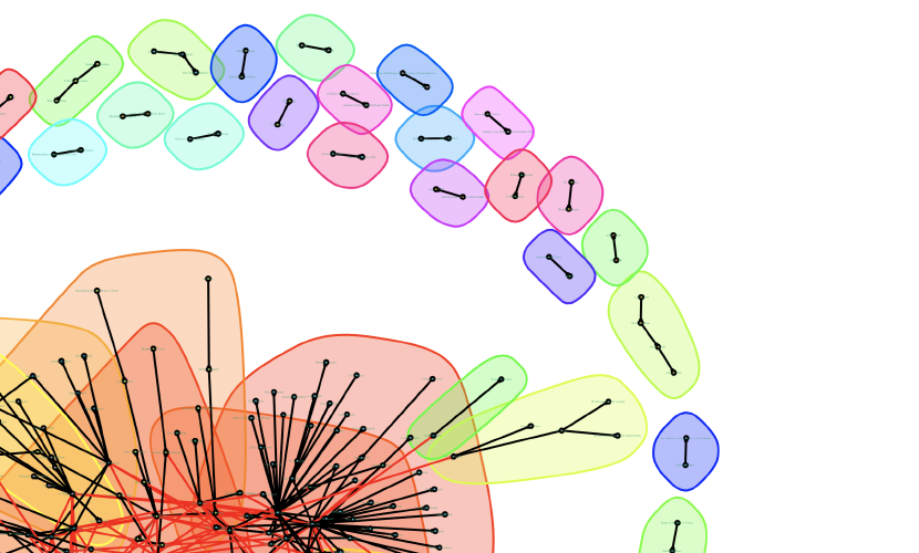
Since Databasic seemed to be broken, I downloaded Gephi for my first attempt at visualizing the network created from our data. While the tutorial was easy to follow, I found the program pretty aesthetically dated and cluttered, making it confusing to navigate. I also wasn’t happy with the final visualization that was produced— much like the program itself, it was busy and difficult to read, especially when exported as an image. Once Palladio was mentioned in the course Discord server, I gave that a whirl instead, and while it is definitely not as powerful of a tool as Gephi, it is much more simple to use and the data representation that you produce is more intuitively interactive. The issue of exporting the visual comes once again in exporting it, as it exports as a JSON object not meant to be used outside of Palladio.
In terms of visualizing and analyzing the networks you create, my favourite method is tied between using R or using Python— I think I’d have to use them more to find out my true favourite. The bonus activity this week using R and igraph created a visualization similar to the ones that Gephi and Palladio did, but using igraph I felt gave me more straight-forward ways to customize the appearance of my visualization through just a few quick google searches. The final product as a whole is still too cluttered (surely there must be a way I can make these visualizations more spread out?), but at least it’s readable when you zoom in and look more closely. Personally, I find the line-by-line aspect of creating R scripts pretty tedious, so network analysis through Python was refreshing for me. Although it didn’t produce a visualization of my network, I was creating a comprehensive program that only has to be run once I finished writing the script to get the data I wanted. Both have their own benefits for network analysis, but I could see myself using Python more if only for the fact that I personally find it faster to build and run.
Overall, I wasn’t really satisfied with any of the visuals I created; but, with all the tools available to me, there are many opportunities to MAKE them what I want through further studying and research. Honestly, if my work is to be digitally published, why should I restrict those who consume my work to a cluttered, static visualization/image? I feel that an interactive, 3D networks where a user can manipulate the visual through zooming in/out and navigating within its tangles would be a much more interesting final product to include within an article or research presentation. This form of imagining data creates a more “tactile” experience, and allows the person consuming the work to make their own conclusions, more closely study the conclusions of my work, and better understand scale, witnessing firsthand the many smaller nodes which form the massive network cluster.
Nitpicking or Necessity?
I briefly mentioned earlier that the actual process of just cleaning the data was the most difficult, and this is not only because it’s kind of tedious, but this is also due to the evaluation of the data being a necessary part of it. Choosing whether or not something should be deleted from your data because it seems nonsensical, whether the information that you’re analyzing is the same and the OCR made an error or these are actually two people who just happen to have very similar names existing in the same historical narrative— you can either throw caution to the wind and hope you’re not wrong merging to data points, or be overly nitpicky like me but end up with less clean data that could hinder further network analysis. Either choice alters the research you produce from the data, and I was nitpicky because I feared being wrong. I don’t want to accidentally misinterpret a history because I chose to merge two characters who were actually separate people with individually important roles, and I feel like this fear shows the merit of historians showing their work.
Typically, a historian shows their work in their footnotes, endnotes, bibliography, e.t.c. These reveal the process of research and allow those who read their work to traceback and validate the information given to them by the historian. Despite the work of a digital historian being less “simple” than a footnote to mark their conclusions on a topic, publicising the networks they analyze, showing the visualizations they used, should all be apart of the final work that is produced. When reviewing scholarly work, the person consuming it should be able to see how conclusions were made, whether that be through the bibliography or a linked csv file. In fact, when it comes to digital history, I feel the process of showing your work is even more important! Much of the data digital historians reference is like the data we worked with this week— OCR text that isn’t always perfectly transcribed. Like I discussed earlier, there are personal choices that have to be made in cleaning this data, and the choices we make may not always be correct. Showing our work not only allows a reader to follow our logic, but also opens us to perhaps valid criticism and the corrections of flaws in the choices we made interpreting the data by someone who may be more knowledgable, collectively generating a better, more accurate history.